


Introduction
Do you spend time building your Notion dashboard, only to realize it’s not actually making you more productive?
At first, it usually feels like a solid system. Everything looks organized, tasks are neatly structured, and your setup feels like it should improve productivity.
But after a few weeks, something feels off. You might start wondering:
• Why isn’t Notion making me more productive even though I set it up properly?
• Why does my setup look good, but doesn’t feel truly productive?
• Or why did I slowly stop using it altogether?
If that sounds familiar, you’re not alone.
And that’s where most DIY Notion dashboards quietly break down—they look organized, but they don’t actually help you get things done.
In this guide, you’ll learn the 7 reasons your Notion dashboard isn’t making you more productive—and exactly how to fix each one so your system actually supports daily execution.
The Real Reason Your Notion Dashboard Isn’t Improving Productivity
Most beginner DIY dashboards are built to store structure: tasks, notes, goals, projects. On the surface, that looks productive because everything is neatly organized in one place.
But productivity doesn’t come from organization alone. It comes from how quickly you can turn what you see into what you do.
And this is where most dashboards break down.
When you open your system, it doesn’t immediately reduce your thinking. Instead, it presents multiple possible directions at once. Nothing is clearly prioritized, nothing is naturally pushed forward, and nothing feels like the obvious next step.
So even though everything is “there,” you still have to interpret it every time:
- What matters most right now?
- What should I focus on first?
- What can wait without consequence?
That small moment of interpretation is where productivity gets lost.
Because instead of your system guiding action, you are doing the work of translating it into action manually.
Over time, this creates a subtle pattern: the dashboard becomes something you check, not something you act from. It holds your work, but it doesn’t move your work forward.
That’s the core reason most Notion dashboards fail to improve productivity—they optimize for structure and visibility, but not for decision and execution flow.
Once that gap exists, even a well-built system will feel like it’s not helping you do more, only helping you keep track of more.
And that’s exactly what the next sections will break down—where that breakdown actually happens, and how it shows up in day-to-day use.
7 Reasons Your Notion Dashboard Feels Useless (And How to Fix Each One)
If your Notion dashboard looks organized but still doesn’t help you get real work done, the issue usually isn’t a single flaw—it’s a combination of small design and workflow gaps that add up over time.
Most dashboards fail to improve productivity for a few consistent reasons:
TL;DR: Your Notion Dashboard Isn't Productive. Fix these first:
These are the core reason most Notion dashboards feel less effective after setup.:
- Everything is mixed together → separate action vs reference
- No clear “what to do now” → create a Today / Next view
- You track but don’t act → connect tracking to tasks
- Too many views → reduce to 1–2 core views
- Nothing updates dynamically → use filters (today, overdue)
- Built for organization, not execution → prioritize usage
- No workflow behind it → add a simple capture → execute loop
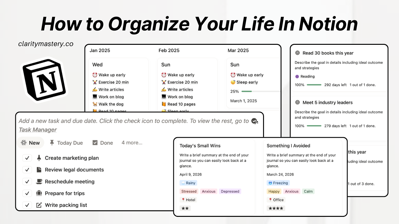
Reason #1: Everything Is Mixed Together
Why does my Notion dashboard feel unproductive when I "everything" inside?
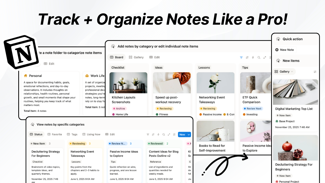
A common reason your Notion dashboard feels unproductive is that different types of information are stored in the same space.
Tasks, notes, goals, and references all sit together in one view, which makes the system look organized—but not clearly structured.
At a glance, everything feels fine. But when you actually use it, nothing is grouped in a way that matches its function.
So instead of instantly understanding what you’re looking at, you’re constantly re-categorizing information as you scan.
This slows down clarity—not because the system is complex, but because everything is visually treated as the same type of information.
Why this happens
The issue isn’t too much information—it’s lack of separation between information types.
Most dashboards mix:
- tasks (things to execute)
- notes (things to remember)
- goals (things to achieve)
- references (things to store)
When everything sits in the same space, your brain has to classify it repeatedly while using it.
That creates visual friction, not execution problems.
So even basic scanning becomes interpretation.
And when nothing is visually prioritized, nothing feels structurally distinct.
How to fix it
The fix is not to reduce content—it’s to separate information by function.
A useful dashboard organizes information before you interact with it, not while you’re using it.
At minimum, split your system into:
- Action layer → tasks, next steps, priorities
- Reference layer → notes, ideas, resources, archives
The goal is simple:
each type of information should “live” in a different mental category before you even start working.
That’s what turns a mixed system into a readable structure.
Reason #2: No Clear Starting Point
Why doesn’t my Notion dashboard help me know what to do first?
Everything is visible, but nothing is prioritized as the default entry point for action.
This is why your Notion dashboard feels unproductive the moment you open it—you’re forced to think before you can act.
Instead of immediately moving into work, you first have to figure out where to begin.
That repeated “start decision” creates hesitation before any execution happens.
Why this happens
The core issue is not organization or visibility—it’s the lack of an initiation layer.
Most dashboards are designed to display information, not to initiate work.
So when you open them:
- there is no predefined “start here” area
- no default action that anchors your attention
- no structured entry into execution
Each session starts with the same silent question:
“What should I begin with?”
That missing entry point forces a pause before any work begins—not because things are unclear, but because nothing is prioritized as the starting action.
This is the hidden reason your Notion setup looks fine but still doesn’t lead to action.
Over time, this creates a pattern where opening the dashboard requires a micro-decision every time, instead of immediately leading into work.
And when starting always requires thinking, momentum weakens before it even begins.
How to fix it
A productive dashboard always begins with a defined entry path for action.
Instead of treating everything equally, you need to design a default starting layer that removes the need to decide where to begin.
A simple structure works:
- Today View → the single starting point for current focus
- Next Action View → the smallest executable steps that move work forward
The key shift is not more structure—it’s defining a default point of entry.
When your dashboard opens and already tells you where to start, you no longer interpret it—you immediately enter execution.
Reason #3: Tracking Without Execution
Why does my Notion dashboard track everything but not improve productivity?
Most users love Notion because it gives a sense of progress:
- checking habits daily
- ticking off tasks
- updating goal databases
- filling progress bars
But despite all this activity, real work output doesn’t increase.
That’s the core problem.
This is a key reason many Notion dashboards feel productive but don’t actually improve output.
Why this happens
The issue isn’t tracking itself. It’s that tracking becomes disconnected from execution.
In most DIY dashboards, people:
- mark habits as “done” without linking them to tasks
- update goal databases separately from daily work
- log progress after work is already finished (or never revisit it)
- treat dashboards as “record keeping” instead of “next action system”
So tracking becomes a post-action ritual, not a driver of action.
It reflects what happened—but never influences what happens next.
What to do instead
Tracking only becomes useful when it is attached to action at the moment of review.
Instead of treating tracking as a separate layer, it should directly influence what you do next.
A simple way to fix this is to redesign your tracking loop so it always leads to action:
- Habit → linked to a task or behavior (not just a checkbox)
- Goal → broken into the next actionable step (not just a target)
- Progress → reviewed through “what changes today?”
The key idea is simple: tracking should never end at measurement. It should always point forward.
When every tracked item has a clear next action attached to it, your dashboard stops being a record of behavior—and starts becoming a system that shapes behavior.
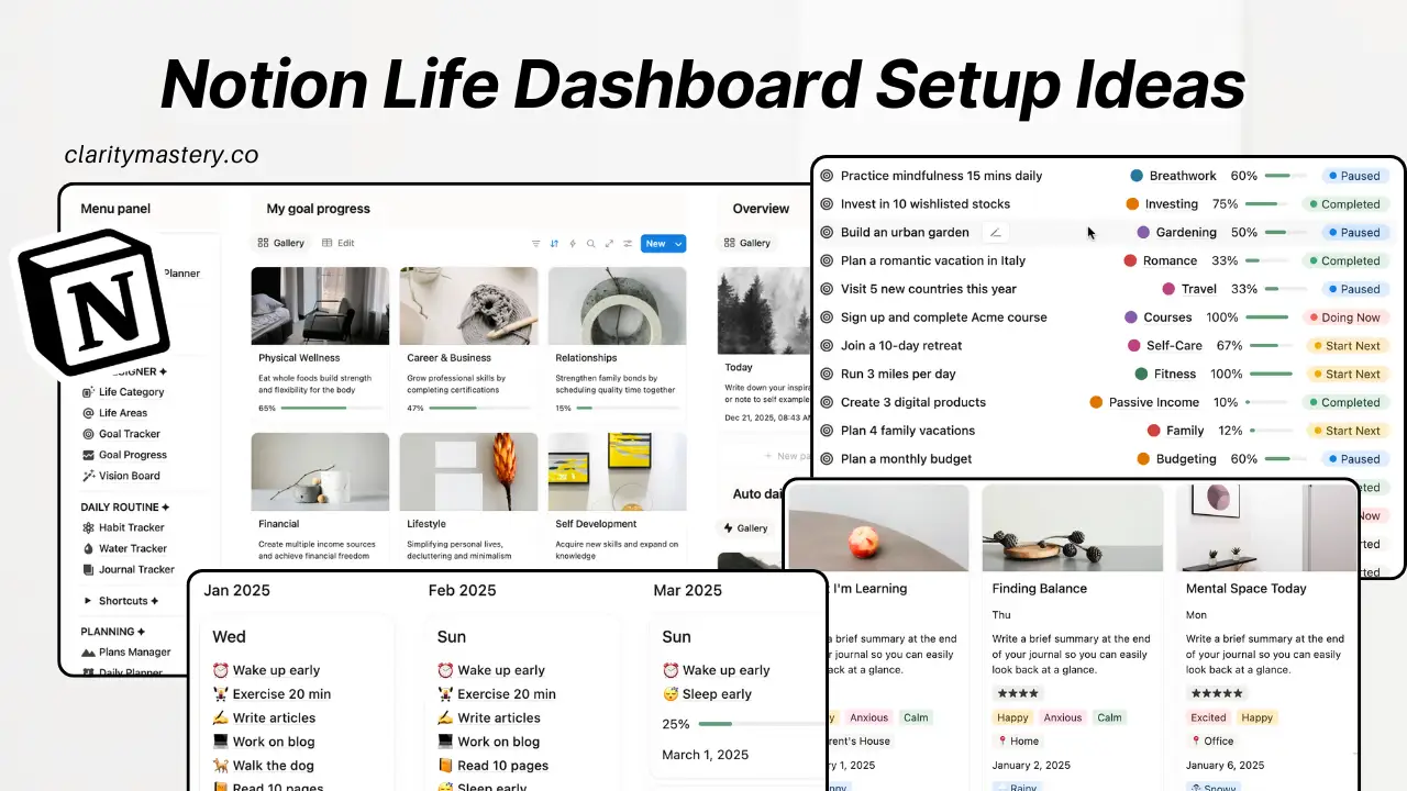
Reason #4: Too Many Views (Navigation problem)
Why does my Notion dashboard feel confusing and what to do about it?
Some dashboards stop working because they offer too many ways to access the same system.
You might have separate views for tasks, projects, habits, and planning—all of which make sense individually.
But together, they create constant switching between perspectives.
Instead of working from one system, you’re choosing which version of the system to use each time.
That choice adds friction before any actual work begins.
Why things break down
The issue isn’t that multiple views exist. It’s that none of them have a clear purpose or hierarchy.
Most dashboards evolve like this:
- one view for tasks
- another for projects
- another for habits
- another for planning
Each view makes sense on its own. But together, they create constant context switching.
Instead of working from a single coherent system, you’re now choosing which version of the system to use every time you open it.
That decision happens before any actual work begins.
And over time, this creates cognitive load—not from the work itself, but from navigating the system.
The more views you add, the harder it becomes to trust any single one of them.
Eventually, the dashboard stops feeling unified. It starts to feel like multiple systems pretending to be one.
How to fix it
Clarity doesn’t come from more views. It comes from fewer, more intentional entry points into the same system.
Instead of optimizing for coverage, optimize for decision speed.
A practical approach:
- Keep 1 primary view that represents daily execution
- Keep 1 secondary view for planning or structure
- Everything else becomes supporting context, not front-facing navigation
The goal is not to remove information, but to reduce the number of ways you have to interpret it.
When you limit the system to just a couple of core perspectives, something important happens: you stop choosing how to work each time you open the dashboard—and start actually working.
Reason #5: Dashboard Is Static (No Real-Time Update)
Why does my Notion dashboard feel confusing when there are too many views?
Some Notion dashboards stop feeling productive because they don’t just give you structure—they give you too many ways to access the same system.
This is where productivity breaks down: not in the work itself, but in choosing where to work from.
You might have separate views for tasks, projects, habits, and planning—all of which make sense individually.
But together, they create constant switching between perspectives.
Instead of working from one system, you’re choosing which version of the system to use each time.
That choice adds friction before any actual work begins.
Why things break down
The issue isn’t that multiple views exist. It’s that none of them have a clear role in the workflow.
Most dashboards evolve like this:
- one view for tasks
- one view for projects
- one view for habits
- one view for planning
Each view makes sense on its own. But together, they create constant context switching.
So instead of working from a single coherent system, you’re now deciding which version of the system to use every time you open it.
This is why your Notion dashboard feels cluttered even when nothing is actually wrong with the setup.
That decision happens before any actual work begins.
And over time, this creates cognitive load—not from the work itself, but from navigating the system.
The more views you add, the harder it becomes to trust any single one of them.
Eventually, the dashboard stops feeling unified. It starts to feel like multiple systems pretending to be one.
Reason #6: Organization-Focused (Usage Mismatch)
Why does my Notion dashboard look organized but I don’t actually use it?
You might spend time making your Notion dashboard look extremely organized.
This is where the hidden productivity issue starts—your system is designed to look right, not to be used often.
Clean sections. Nice spacing. Logical structure. Everything feels “correct.”
But despite all that effort, you don’t actually use it much.
That’s the hidden failure: the system is designed to be organized, not to support productivity through action.
What’s actually going wrong
The problem isn’t structure—it’s intent.
Most DIY dashboards are built around:
- organizing information neatly
- making things easy to store and retrieve
- keeping layouts visually clean
But very little attention goes into how often or how directly the system supports actual work.
So what happens is simple:
You end up with a dashboard that looks complete, but doesn’t naturally get used in your daily workflow.
It becomes something you maintain occasionally, instead of something that actively supports execution.
This is why your Notion dashboard feels “finished” but still doesn’t improve your productivity.
And once that happens, even a well-designed system stops improving your productivity.
How to fix it
A useful dashboard isn’t designed around how things are organized—it’s designed around how quickly they turn into action.
The key shift is asking:
“Does this help me act faster, or just store better?”
To fix it, structure your dashboard around usage intensity:
- Daily-use elements → front and center (what drives immediate execution)
- Weekly-use elements → accessible but not dominant
- Rare-use elements → stored deeper, not competing for attention
The more something contributes to execution, the more visible and frictionless it should be.
When you design around action instead of organization, your dashboard stops being something that just looks complete—and becomes something that actually improves productivity.
Reason #7: No workflow behind it (lack of system)
Why does my Notion dashboard feel useless even though everything is organized?
Some Notion dashboards fail not because of structure, but because there is no workflow connecting the system.
This is where your Notion dashboard stops improving productivity and becomes just a place where information sits.
Work gets added, stored, and occasionally checked off—but there is no clear movement from capture to completion.
Without a defined flow, the dashboard becomes a static container.
It holds information but does not guide how work progresses.
Over time, this is exactly why your Notion dashboard isn’t productive anymore—it feels passive instead of functional.
Why this happens
The issue isn’t structure, visibility, or even clarity.
It’s the absence of a working loop behind the dashboard.
Most setups focus heavily on what the dashboard looks like:
- where tasks are placed
- how information is organized
- what sections are visible
But very little attention is given to how work actually moves through the system over time.
So what you end up with is a static container:
- things get added
- things sit there
- things get occasionally checked off
SERP hook: This is one of the main reasons your Notion dashboard stops making you more productive even when it looks complete.
But there’s no built-in progression from capture → decision → execution.
Without that flow, the dashboard becomes passive. It holds information, but it doesn’t process anything.
Apply these changes
A useful dashboard isn’t just a place—it’s a simple workflow that actually moves work forward.
Instead of thinking in terms of structure, think in terms of movement.
At its core, your system only needs three stages:
- Capture → everything new enters the system here
- Plan → decide what actually matters and when it should happen
- Execute → work gets done from a clearly defined set of actions
The key is not complexity—it’s continuity.
Each stage should naturally feed the next, without requiring you to rethink the system every time you use it.
When this loop exists, your dashboard stops being a passive overview and becomes an active flow of work.
And that’s the shift that explains why most Notion dashboards aren’t productive—and why yours doesn’t have to be one of them.
Key Takeaways: Why Your Notion Dashboard Isn't Productive
Most people start building a Notion dashboard from structure—pages, databases, layouts, sections.
But they rarely start from what actually matters: how the system should support real work.
How decisions are made, how tasks move forward, and how work actually gets completed.
Because of that, the dashboard quietly becomes a place to organize information first, instead of a system that supports execution.
That’s why your Notion dashboard isn’t productive even when it looks well-designed.
The same pattern shows up again and again:
- too much information competing for attention
- no clear starting point for action
- tracking that isn’t tied to execution
- systems that feel complete but don’t guide what to do next
At its core, the issue isn’t how you use Notion—it’s how the system was designed in the first place.
Once you shift from organizing work to enabling work, everything changes.
The dashboard stops being something you constantly manage… and becomes something that naturally helps you move through your work with less friction.
Frequently Asked Questions
1. Why does my Notion dashboard feel useless even after I set it up properly?
A Notion dashboard often feels useless after setup because it looks organized but doesn’t guide daily action. Most systems focus on structure, not decision-making, so you still have to figure out what to do every time you open it.
2. Why isn’t my Notion dashboard making me more productive?
Because it stores information instead of driving execution. A dashboard only improves productivity when it clearly shows what to do next, not just what exists in your system.
3. Why do Notion dashboards stop working after a few weeks?
They usually stop working because the system doesn’t evolve with your actual workflow. Over time, tasks, notes, and goals pile up without clear priority or structure for action.
4. Do I need to rebuild my Notion dashboard if it’s not working?
Not usually. Most problems come from how the dashboard is used, not how it is built. Fixing structure, priorities, and workflow flow is often enough without rebuilding everything.
5. What is the biggest reason Notion dashboards fail?
The biggest reason is that they are designed for organization, not for action. They look complete but don’t help you decide or execute faster in daily use.
6. How do I fix a Notion dashboard that feels overwhelming?
Reduce decision points. Your dashboard should immediately show what matters today and hide everything that is not relevant to current action.


.png)

