

Introduction
Do you spend time building your Notion dashboard, only to feel it becomes useless over time—until you eventually abandon it or quit using it altogether?
At first, it usually feels like a solid system. Everything looks organized, tasks are neatly structured, and your setup feels like it should improve productivity.
But after a few weeks of using your Notion dashboard, you start realizing it doesn’t actually make you more productive.
The problem isn’t Notion itself, but the way the dashboard stops translating structure into action. It holds information well, but it doesn’t guide what you should focus on next. So instead of reducing thinking, it adds a layer of hesitation every time you open it.
When that happens, the dashboard slowly shifts from being a working tool to something you simply maintain. And once it no longer influences your daily decisions, it naturally gets pushed aside—no matter how clean or well-designed it looks.
In this guide, you will see the most common reasons Notion dashboards lose their usefulness over time, and exactly how to fix each mistake so your Notion actually supports daily action instead of getting abandoned.
The Real Problem: Why Your Notion Dashboard Doesn’t Work
What makes a dashboard feel useful isn’t how much it contains—it’s how quickly it helps you move.
Most dashboards aren’t actually broken. They already have tasks, goals, and structure in place.
But when you open them, they still require you to figure things out before taking action.
That extra thinking step is where things fall apart.
A productive dashboard should reduce decision friction—the mental effort required to decide what to do next.
If you have to scan, interpret, or choose between too many options, the system slows you down instead of supporting you.
This is why adding more features rarely fixes the problem.
The issue isn’t what your dashboard includes—it’s how clearly it guides your next action.
Once you see it this way, most dashboard problems become easier to spot—and easier to fix.
7 Reasons Your Notion Dashboard Feels Useless (And How to Fix Each One)
Below are the most common patterns that cause this—and how to correct them without starting over.
TL;DR: Your dashboard feels useless and not working. Fix these first:
These are the core reason most Notion dashboards feel less effective after setup.:
- Everything is mixed together → separate action vs reference
- No clear “what to do now” → create a Today / Next view
- You track but don’t act → connect tracking to tasks
- Too many views → reduce to 1–2 core views
- Nothing updates dynamically → use filters (today, overdue)
- Built for organization, not execution → prioritize usage
- No workflow behind it → add a simple capture → execute loop
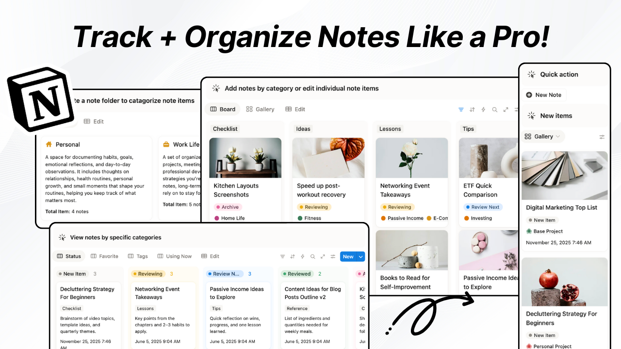
Mistake #1: Your Dashboard Shows Everything
A common pattern behind an unhelpful dashboard is this: everything ends up in a single space, which is why it often feels useless in practice.
What starts as a clean “all-in-one” setup gradually turns into a mix of tasks, notes, goals, and references—without clear boundaries between them.
At a glance, it still looks organized. But in practice, it forces your brain to process too many different types of information at once.
The core problem
The issue isn’t volume—it’s lack of separation between different types of information.
When tasks, notes, goals, and reference material all sit in the same visual space, your brain has to constantly re-categorize everything it sees.
Instead of quickly understanding structure, you’re forced to ask:
“What is this supposed to be?”
That repeated interpretation slows everything down. Even simple scanning becomes mental effort.
And when everything sits at the same level, nothing naturally stands out as more important than the rest.
So the dashboard stops feeling structured—even if it’s technically well-organized.
How to fix this
The solution isn’t to reduce what you store—it’s to separate what belongs together from what doesn’t.
A useful dashboard doesn’t flatten everything into one view. It organizes information by function before it reaches your attention.
At a minimum, split your system into two clear layers:
- Action layer → tasks, next steps, priorities (things you eventually execute)
- Reference layer → notes, ideas, resources, archives (things you store but don’t act on immediately)
Your dashboard should primarily expose structure, not everything at once. The goal is not to see more—it’s to see things in the right categories instantly.
Well-designed systems (including advanced templates) still connect everything behind the scenes—but what appears upfront is already grouped and filtered so your brain doesn’t have to do the sorting.
That separation removes the “everything feels the same” problem before it even starts.
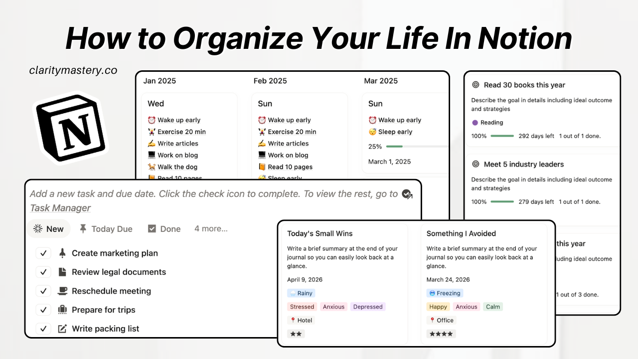
Mistake #2: No Clear “What Should I Do Now?” (Notion Dashboard Lacks Direction)
A dashboard can contain everything you need and still fail at the most important moment: when you open it and try to start working on projects..
This is where a Notion dashboard feels overwhelming for most users.
If the first few seconds feel uncertain—like you’re scanning instead of acting—then your dashboard isn’t guiding behavior. It’s waiting for you to decide where to begin.
Why this happens
The issue isn’t how your dashboard is organized. It’s that nothing inside it clearly signals a starting point.
Most dashboards present information without hierarchy:
- everything appears equally accessible
- nothing is visually or functionally prioritized for immediate action
- the system assumes you already know what matters today
So instead of naturally landing on your next step, your brain has to re-evaluate where to start every time you open it.
That repeated “starting decision” creates hesitation. And hesitation is what kills momentum before work even begins.
How to fix it
A useful dashboard always answers one silent question immediately:
“What should I do right now?”
To solve this, you need to establish a clear entry point for action—something that always leads your attention first.
This doesn’t mean reorganizing your entire system. It means defining a single, obvious place your attention should land when you open it.
A simple structure works best:
- Today View → what matters right now (priority or time-sensitive tasks)
- Next Actions View → small, executable steps that move work forward
Everything else can still exist in the system—but it should not compete for initial attention when you open the dashboard.
The key shift is this: your dashboard should not make you decide where to start. It should already start you.
Mistake #3: Tracking Without Execution (Feels Unproductive)
Some dashboards don’t fail because they’re messy or unclear.
They fail because they quietly turn into tracking systems instead of working systems.
At first, it feels productive—everything is measured, logged, and visually satisfying. But over time, you start noticing something odd: you’re tracking progress, but nothing is actually moving forward.
Why this happens
The issue isn’t tracking itself. It’s that tracking becomes disconnected from action.
Most dashboards treat habits, goals, and progress as standalone elements:
- habits get ticked off daily
- goals sit in a separate database
- progress is recorded but not referenced
So the system becomes reflective, not active. It tells you what happened, but not what to do next.
Without a bridge between tracking and execution, progress becomes passive information instead of a trigger for behavior.
And once that happens, consistency becomes harder—not easier—because nothing in the system forces a response.
What to do instead
Tracking only becomes useful when it is attached to action at the moment of review.
Instead of treating tracking as a separate layer, it should directly influence what you do next.
A simple way to fix this is to redesign your tracking loop so it always leads to action:
- Habit → linked to a task or behavior (not just a checkbox)
- Goal → broken into next actionable step (not just a target)
- Progress → reviewed through “what changes today?”
The key idea is this: tracking should never end at measurement. It should always point forward.
When every tracked item has a clear next action attached to it, the dashboard stops being a record of behavior—and starts becoming a system that shapes behavior.
Mistake #4: Too Many Views, Not Enough Clarity
Some dashboards don’t feel useless because they lack features.
They feel useless because they offer too many ways to look at the same system—and none of them feel like the “right” one.
At that point, the problem isn’t organization anymore. It’s fragmentation.
Why things breaks down
The issue isn’t that multiple views exist. It’s that none of them have a clear purpose or hierarchy.
Most dashboards evolve like this:
- one view for tasks
- another for projects
- another for habits
- another for planning
Each view makes sense on its own. But together, they force constant context switching.
Instead of working from a single coherent system, you’re now choosing which version of the system to use every time you open it.
That choice creates cognitive load before any actual work begins. And the more views you add, the harder it becomes to trust any single one of them.
Eventually, the dashboard stops feeling unified—it feels like multiple systems pretending to be one.
How to fix it
Clarity doesn’t come from more views. It comes from fewer, more intentional entry points into the same system.
Instead of optimizing for coverage, optimize for decision speed.
A practical approach:
- Keep 1 primary view that represents daily execution
- Keep 1 secondary view for planning or structure
- Everything else becomes supporting context, not front-facing navigation
The goal is not to remove information, but to reduce the number of ways you have to think about it.
When you limit the system to just a couple of core perspectives, something important happens: you stop choosing how to work each time you open the dashboard—and start actually working.
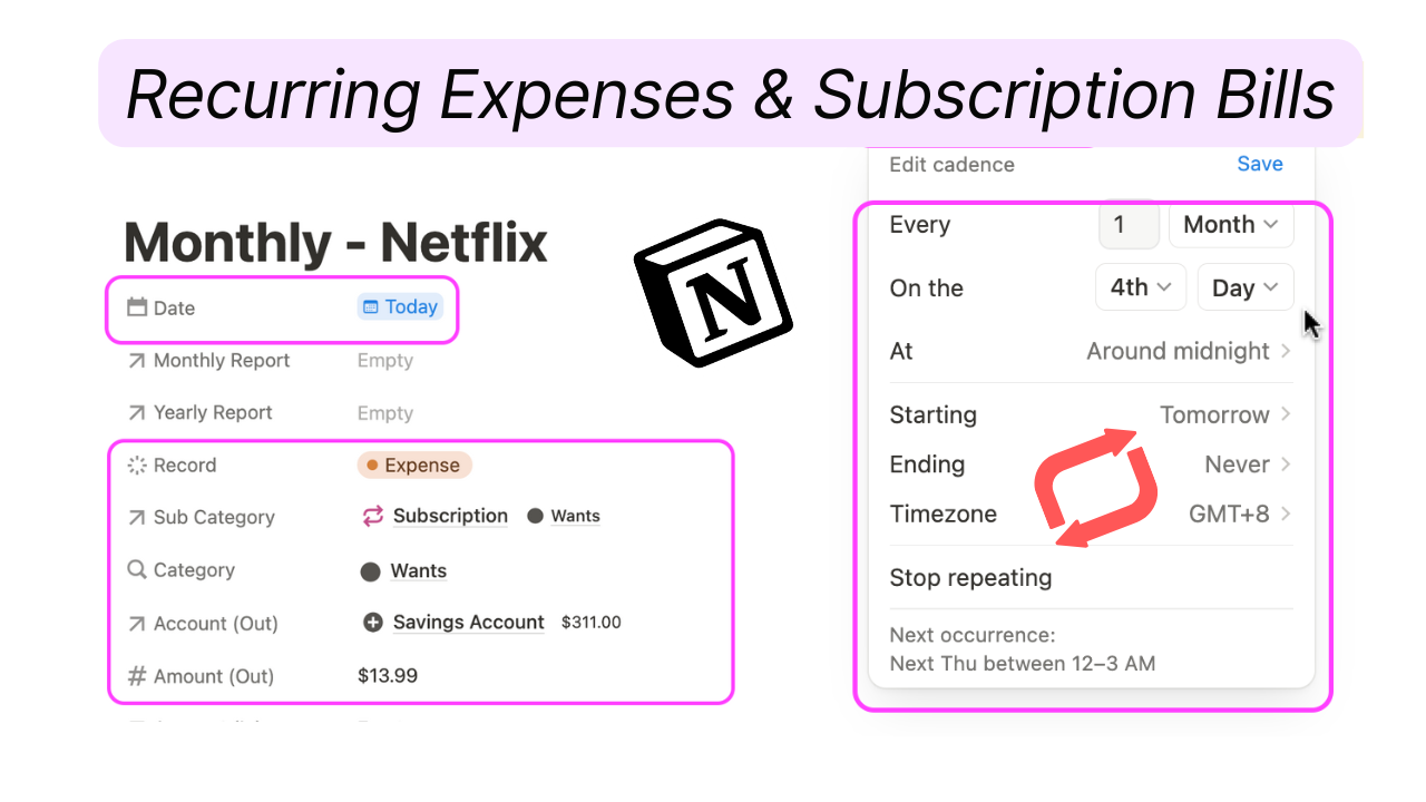
Mistake #5: Your Dashboard Is Static (Feels Unhelpful)
Some dashboards don’t feel broken because of what’s inside them. They often appear fine even when the Notion dashboard is not working as intended.
They feel broken because nothing responds to time.
You open them today, tomorrow, or next week—and it looks exactly the same. No shift, no update, no sense of movement.
Over time, it stops feeling like a working space and starts feeling like a snapshot.
Why this happens
The issue isn’t missing data. It’s that your dashboard is not time-aware.
Most setups treat all information as permanent and always-visible:
- tasks don’t change based on urgency
- deadlines don’t reshape what you see
- older items stay visually equal to newer ones
So instead of reflecting what actually matters right now, the dashboard shows everything as if it matters equally at all times.
That creates a subtle problem: your system stops reflecting reality.
And when a system doesn’t update with your day, you stop relying on it to guide your day.
The solution
A useful dashboard should behave like a live surface, not a static board.
That doesn’t mean adding complexity—it means letting time reshape what you see.
The simplest way to fix this is to introduce filtered, real-time views that automatically change what appears:
- Today View → only what is due or relevant today
- Overdue View → what needs immediate attention
- Upcoming View → what’s approaching but not urgent yet
The key shift is this: you’re no longer manually sorting relevance each time you open the dashboard.
Instead, the system updates what is visible based on time context.
When your dashboard starts reflecting urgency automatically, it stops feeling static—and starts feeling like something that moves with your work, not something you constantly have to reorganize.
Mistake #6: You Built for Organization, Not Action
Some dashboards look extremely well put together.
Clean sections. Nice spacing. Logical structure. Everything feels “correct.”
But despite all that effort, you don’t actually use it much.
That’s the hidden failure: the system is designed to be organized, not to be acted on.
What’s actually going wrong
The issue isn’t structure or clarity. It’s the intent behind the design.
Most dashboards are built with a focus on:
- organizing information neatly
- making things easy to store and retrieve
- keeping layouts visually simple and structured
But very little attention goes into how often each part is actually used in real workflows.
So what happens is this:
you end up with a system that looks complete, but doesn’t get pulled into your daily behavior.
It becomes something you maintain occasionally, instead of something you rely on constantly.
And once that shift happens, even a “perfectly organized” dashboard loses relevance.
How to fix it
A useful dashboard is not designed around how things are stored—it’s designed around how often they are used.
The question shifts from:
“Where should this go?”
to:
“How often will I actually interact with this?”
To fix this, redesign your dashboard based on usage frequency:
- Daily-use elements → placed front and center (what you open repeatedly)
- Weekly-use elements → accessible, but not dominant
- Rare-use elements → stored deeper in the system, not surfaced upfront
This shifts your dashboard from storage-first to action-first use.
The more frequently something is used, the more visible and frictionless it should be.
When you design around usage instead of organization, the dashboard stops being something that just looks complete—and becomes something that actually gets used in real work.
Mistake #7: No System Behind the Notion Dashboard
Some dashboards don’t feel useless because they’re poorly designed, but because they lack real usefulness in workflow.
You open it, look around, maybe update a few things—but there’s no sense that anything is actually moving from one stage to another.
It exists as a destination, not as part of a process.
Why this happens
The issue isn’t structure, visibility, or even clarity.
It’s the absence of a working loop behind the dashboard.
Most setups focus heavily on what the dashboard looks like:
- where tasks are placed
- how information is organized
- what sections are visible
But very little attention is given to how work actually moves through the system over time.
So what you end up with is a static container:
- things get added
- things sit there
- things get occasionally checked off
But there’s no built-in progression from starting work → making decisions → finishing work.
Without that flow, the dashboard becomes passive. It holds information, but it doesn’t process anything.
Apply these changes
A useful dashboard isn’t just a place—it’s a simple workflow that actually moves work forward.
Instead of thinking in terms of structure, think in terms of movement.
At its core, your system only needs three stages:
- Capture → everything new enters the system here
- Plan → decide what actually matters and when it should happen
- Execute → work gets done from a clearly defined set of actions
The key is not complexity—it’s continuity.
Each stage should naturally feed the next, without requiring you to rethink the system every time you use it.
When this loop exists, your dashboard stops being a passive overview and becomes an active flow of work.
And that’s the shift that turns a “dashboard you maintain” into a system you actually rely on.
Key Takeaways: Why Your Notion Dashboard Feels Useless
Good news: You don’t to rebuild a completely new dashboard from scratch!
Most of the time, the issue isn’t missing layouts—it’s that the existing structure isn’t guiding your attention or actions clearly enough.
Across all the common failure points, the pattern is consistent:
- too much competing information
- no clear starting point
- weak connection between tracking and action
- too many ways to interpret the system instead of using it
When these stack together, even a well-built dashboard starts to feel unhelpful.
The fix isn’t complexity. It’s clarity, reduction, and restoring a clear flow between what matters and what happens next.
Once that shifts, the dashboard stops feeling like something you need to manage—and starts functioning as something that quietly supports your work.
Frequently Asked Questions
1. Why does my Notion dashboard feel useless even though I organized it?
This usually happens when your dashboard is organized visually but not functionally.
Even if everything looks clean, it can still feel unhelpful if it doesn’t clearly separate what you should act on from what you’re just storing or reviewing.
In most cases, the issue isn’t organization—it’s lack of clarity in how the system supports your daily decisions.
2. What makes a Notion dashboard actually work?
A productive dashboard doesn’t show everything—it shows what matters right now.
It should:
- highlight your next actions clearly
- reduce the number of decisions you need to make
- separate active work from stored information
If your dashboard still requires you to “figure out what to do,” it’s not doing its job yet.
3. Why do Notion dashboards become overwhelming over time?
Dashboards usually become overwhelming when new elements are added without removing or rethinking existing ones.
Over time, everything starts competing for attention:
- tasks
- notes
- goals
- references
When nothing is filtered or prioritized, the system becomes harder to interpret—even if it’s technically well-structured.
4. Do I need to rebuild my Notion dashboard to fix it?
Not usually.
In most cases, rebuilding is unnecessary. The issue is rarely the setup itself, but how the existing elements are organized and surfaced.
A simpler approach is to reduce what appears upfront and make your most important actions easier to access.
5. What is the biggest mistake people make with Notion dashboards?
The most common mistake is treating the dashboard as a place to store everything instead of a place to guide action.
When everything is treated equally, nothing feels important enough to act on immediately.
6. How do I make my Notion dashboard easier to use daily?
Focus less on adding features and more on reducing friction when you open it.
A useful dashboard should:
- immediately show what matters today
- minimize unnecessary decisions
- keep secondary information out of your main view
The easier it is to start working, the more useful your dashboard becomes.


.png)

